How the Yield Curve Shape Helps You Structure Loans

Bankers should consider the shape of the yield curve when structuring, marketing, and pricing loans to maximize return and reduce risk. The shape of the yield curve can also help lenders understand borrowers’ needs and better position the bank against competitors.
Definition of The Yield Curve
A yield curve plots interest rates with different maturity dates but for the same credit quality or counterparty. While swap and Treasury yields are the most frequently reported yield curves, a yield curve can be constructed for any credit counterparty. In this article, we will utilize the US Treasury curve to explain lending strategies that have and continue to work for various yield curve shapes and business cycles. The advantage of using a yield curve is that it allows lenders to compare different loan maturities against a common benchmark. Bankers can then price loans off the benchmark (using the yield curve to adjust for the tenor of commitment). However, the shape of the yield curve is also a predictor of economic output and growth, and potentially credit quality, interest rate risk, and is a powerful marketing tool.
Historical Comparison of Yield Curve Shape
The shape and absolute level of the yield curve is a strong factor affecting credit risk, interest rate risk, and sales/marketing approach to commercial loans. The graph below shows nine yield curves from 1999 to the present. Comparing different shapes, levels, and prevailing economic environments is very telling in how banks position their credit products and the performance outcomes for these banks.
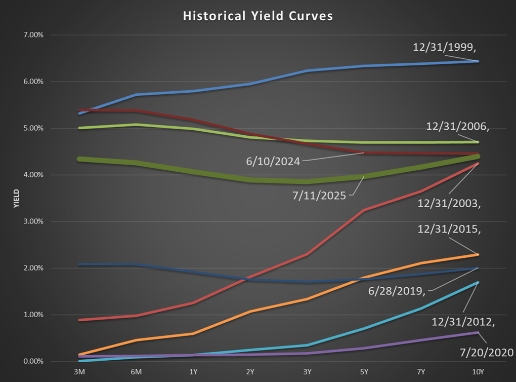
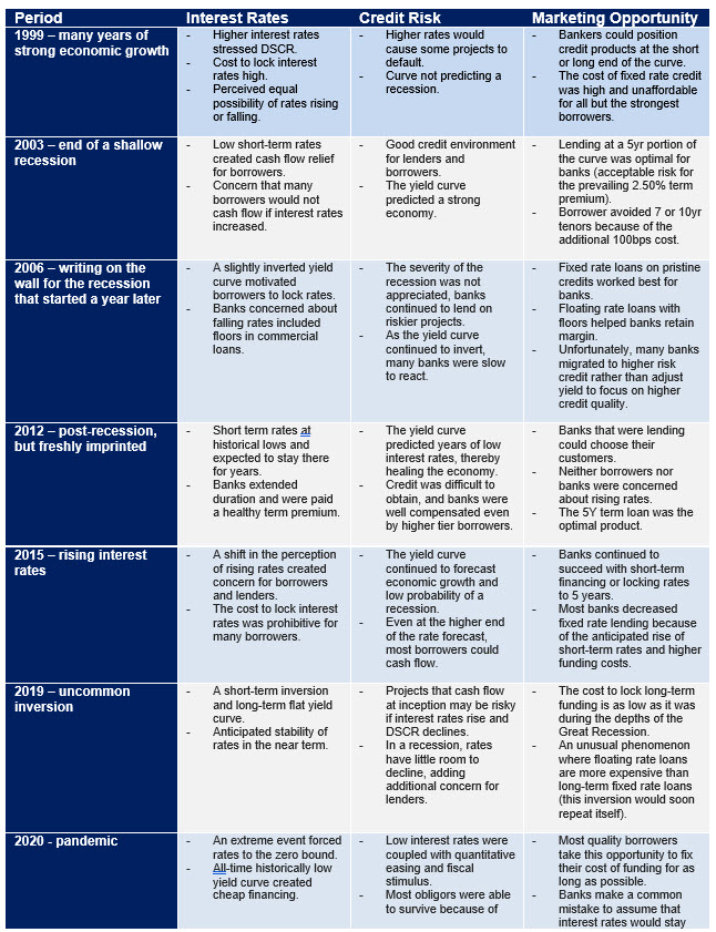
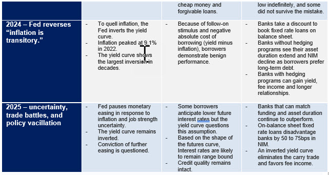
In the table below, we will isolate each period and consider the germane signs from the shape and position of the yield curve on credit risk, interest rate risk, and commercial loan marketing. In December 1999, the US economy had experienced almost ten years of growth, and outside of the Y2K scare, lenders and borrowers were upbeat about the state of the US economic markets. However, interest rates were high based on the then current historical standards. Higher interest rates resulted in lower cash flow coverage. However, businesses were able to plan for their cost of capital and manage their debt payments.
Further, the term premium (the cost to the borrower for 5 or 10yrs vs. float) was significant – over 110 bps. Borrowers could be convinced to float or lock shorter terms because of the cost of the term premium (higher cost to borrower for longer periods). Any reduction in interest rates helped both lenders and borrowers in added cost savings. Banks could position commercial loans as floating, and short term fixed and attract borrowers. However, the table below outlines how the shape and level of the yield curve for each period altered lender and borrower motivation and changed interest and credit risks and altered sales opportunities for banks.
Conclusion
By observing and responding to the yield curve, bankers can better assess risks caused by interest rate movements and credit migration. The yield curve also creates unique marketing and sales opportunities for community banks. In the present environment, the uncertainty of trade and immigration, and high budget deficits make the direction of interest rates highly uncertain. The yield curve is slightly inverted, and, aside from period of recessions, low. The challenge for banks is finding relationships, and not transactions waiting for the possibility of interest rates to decline – not a sound strategy for any borrower and lender. It is the wrong time for banks to accept lower yields for longer-term, higher risk credit.