
Avoiding the Flaw of Averages [Free Tool]

Last week, we presented peer group analysis with a free tool banks can use to compare themselves against others. We also provided a methodology for doing that. In case you missed it, be sure to go HERE. In this article, we want to highlight one other issue that we touched on but didn’t explore in depth—the “Flaw of Averages.” We explain how to keep averages in context and what they mean for your analysis and provide a free tool at the bottom to analyze your bank.
The Flaw of Averages Problem
The average American adult is 5’9” and weighs 180 pounds. The average American family has 2.3 children. However, no one has 2.3 children, and very few Americans are 5’9” and weigh 180 pounds.
The lesson here is that the average hides the extremes. A simple number cannot adequately describe a data set. While you might plan for the average, you should really understand the extremes so you can plan for the worst case.
In banking, this also matters, as it is very common to compare your bank with the average of its peers.
For example, the 3.21% figure is the average net interest margin (NIM) for the industry, weighted by asset size. It’s a feel-good number, as four out of five banks beat it. When you consider that the median NIM is 3.81%, a different picture emerges. Sixty basis points sit between the industry average and a typical bank. Because 50 banks hold about 75% of the assets, the weighted average describes the system, not your footprint. Herein lies the problem.
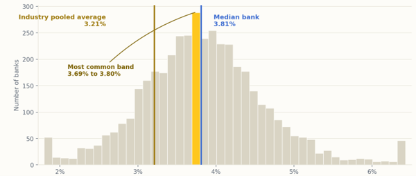
This phenomenon is often called the “flaw of averages,” and it affects banks when they design products, policies, or strategies around peer group comparisons.
How to Mitigate the Flaw of Averages
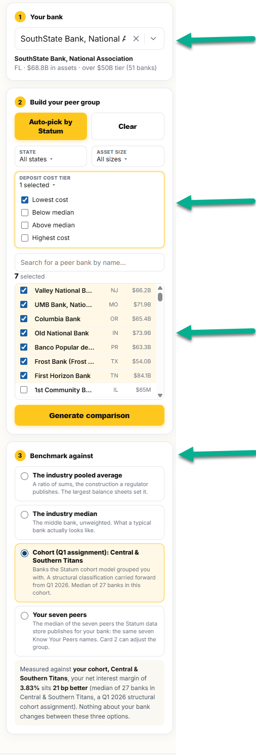 We partnered with Amberoon to create a free tool your bank can use to understand the relationship to various averages. This allows you to focus on metrics that are most relevant to your bank. You can follow along with the tool HERE (or click the Assessment Tool button below).
Like we discussed last week, first you choose the peer group you want to focus on. As we advocated in our previous article, our best practice is to create multiple peer groups. Specifically, we would create the following:
- A peer group of competitor banks in our market that are roughly around our size, plus or minus 25% of total assets.
- Peer group of banks our size and orientation across the nation.
- A peer group of banks with our orientation that perform better than us, such as banks in the top 10% of overall performance.
- Various other peer banks that we want to emulate in certain areas, such as deposit structure. These banks may not be overall top performers, but they may be doing things right when it comes to generating fee income, having a low deposit beta, or generating outsized returns.
Once selected, you can choose what you want to benchmark your bank against.
Now, you can see where your bank sits across various populations. You can toggle on the major metrics, such as NIM, cost of deposits, loan yield, and others.
Comparing Where You Sit
The tool provides targets for each desired metric. You can see your bank next to the industry median, the industry pooled average, which is heavily influenced by the largest banks, our recommended cohort based on similarly sized banks in your region, and the median of whichever peer group you selected. We have created a default peer group for every bank.
Another interesting concept in this analysis is that you can see the actual bell-shaped distribution with the long tails. You can also see where the top 1% and bottom 1% come in, along with the shape of the distribution.
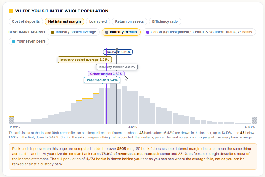
In this analysis, we also provide a breakdown of your high-level metrics compared with the selected peer group, where your margin ranks against every bank, and the distance from your cohort. We also chart how the flaw of averages affects your bank and highlight items that stand out when your metrics are compared with the medians or averages.
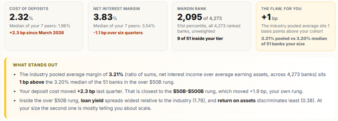
As shown below, SouthState is very close to the average of our peer group, but for some banks, this number can be substantial. In these cases, it is helpful to know which banks have large differences and why.
The Size Ladder
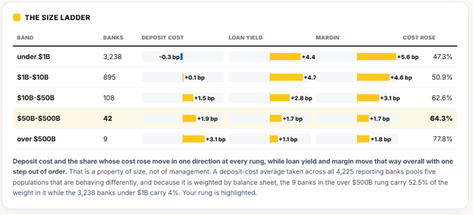
Under the “Size Ladder” tab, we provide the net change in each metric compared with the size cohort. This helps explain the impact of scale on each metric. For example, as shown below, it is helpful to know that deposit costs decreased for banks under $1B but increased for everyone else relative to size. Here, you can see how size affects loan yield, margin, and non-interest expense.
Which Metrics Matter at Your Size
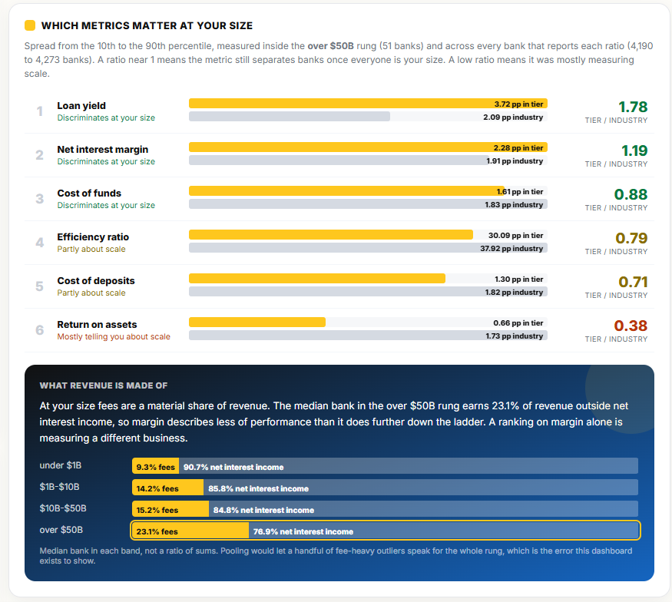
The analysis then asks the opposite question: after adjusting for size, which metrics matter? Below, a ratio of “1” means your bank generates performance equal to the size of your peers. The higher the ratio above “1,” the more that metric has less to do with size and more to do with individual performance. On the opposite side, a ratio below “1” means that most of that metric’s performance is influenced by size or scale.
The analysis goes on to detail how banks our size generate superior performance by focusing more on fee income generation. If you go to the analysis, we provide six quarters of data so you can see the trends of your bank against the various cohorts and industry averages.
Putting This into Action
The purpose of this analysis is to help your bank understand how it performs against various peer groups and the related averages while giving you context around asset size and metric distribution. After reviewing the data, the hope is that you have a better feel for what benchmarks you should be using from the right peer group.
If you are like us, you will hopefully come to the conclusion that you should have one peer group of banks your size and in your footprint, another peer group of your largest competitors, and an aspirational peer group that gives you the medians for the top decile of banks that are like you, regardless of size.
Through this methodology, you can better track how your bank performs in its market and determine what products, services, strategies, or tactics are worth emulating.
Using the peer group analysis, you can then see the dollar value of each metric’s difference so you can determine the appropriate amount of capital to devote to any given effort, such as lowering deposit costs or enhancing margin.
Run your bank through the analysis and see what you can glean.
The tool featured in this article lives in our free portal, next to the resources, dashboards, and calculators that over a thousand community banks use to make sharper decisions.You've read the article. Now use the tool.